Docplanner IA
Simplifying Docplanner's information architecture to ensure smooth and easy to understand experience for doctors.
Company
DocplannerYear
2020Scope
UI & UX Design, Prototyping, Documentation
Background
Over time, Docplanner's platform for doctors expanded rapidly in terms of functionalities and complexity. As the product grew, we encountered several issues that demanded our attention and focus to ensure smooth navigation and integration, providing a great user experience.
Understanding the problems
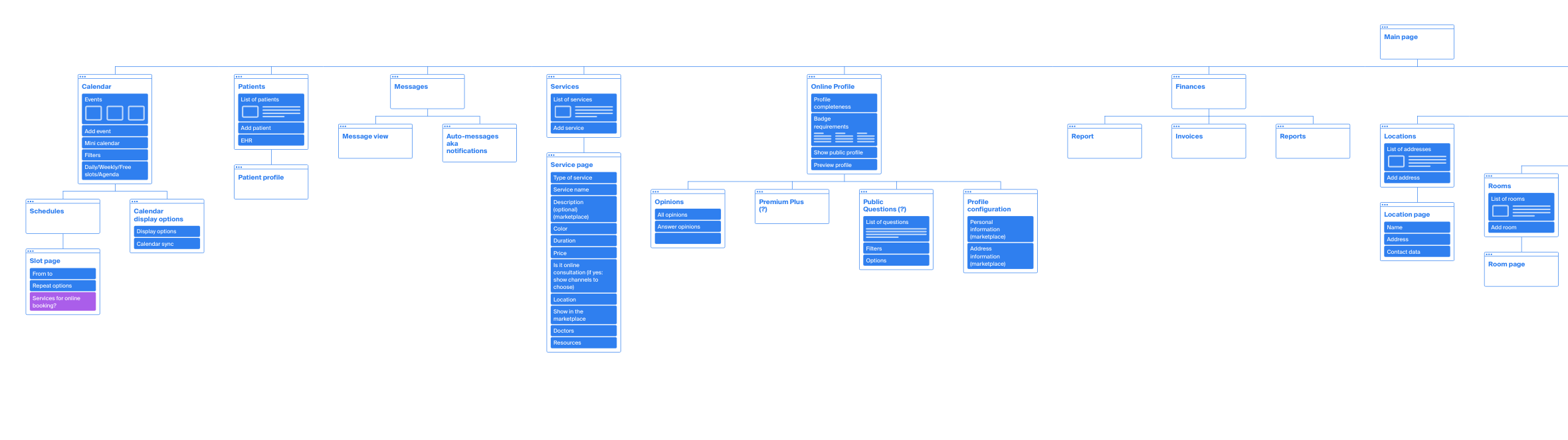
To gain a comprehensive understanding of the product's issues, we mapped its entire architecture and consulted with the Customer Success team to identify the pain points experienced by doctors and secretaries.
Indentified issues
- Zigzag Experience: Docplanner's systems demand step-by-step setup, causing a toggling user journey.
- Workflow Confusion: Users struggle to locate specific features.
- UX Inconsistency: Varied UX patterns and layouts for similar tasks.
- Tutor Dependency: Need for a CS tutor to set up features.
- Redundant Features: Some features are only valuable for a few, cluttering the software for others.
- Duplicate Settings: Certain configurations are accessible from two places.
Approach
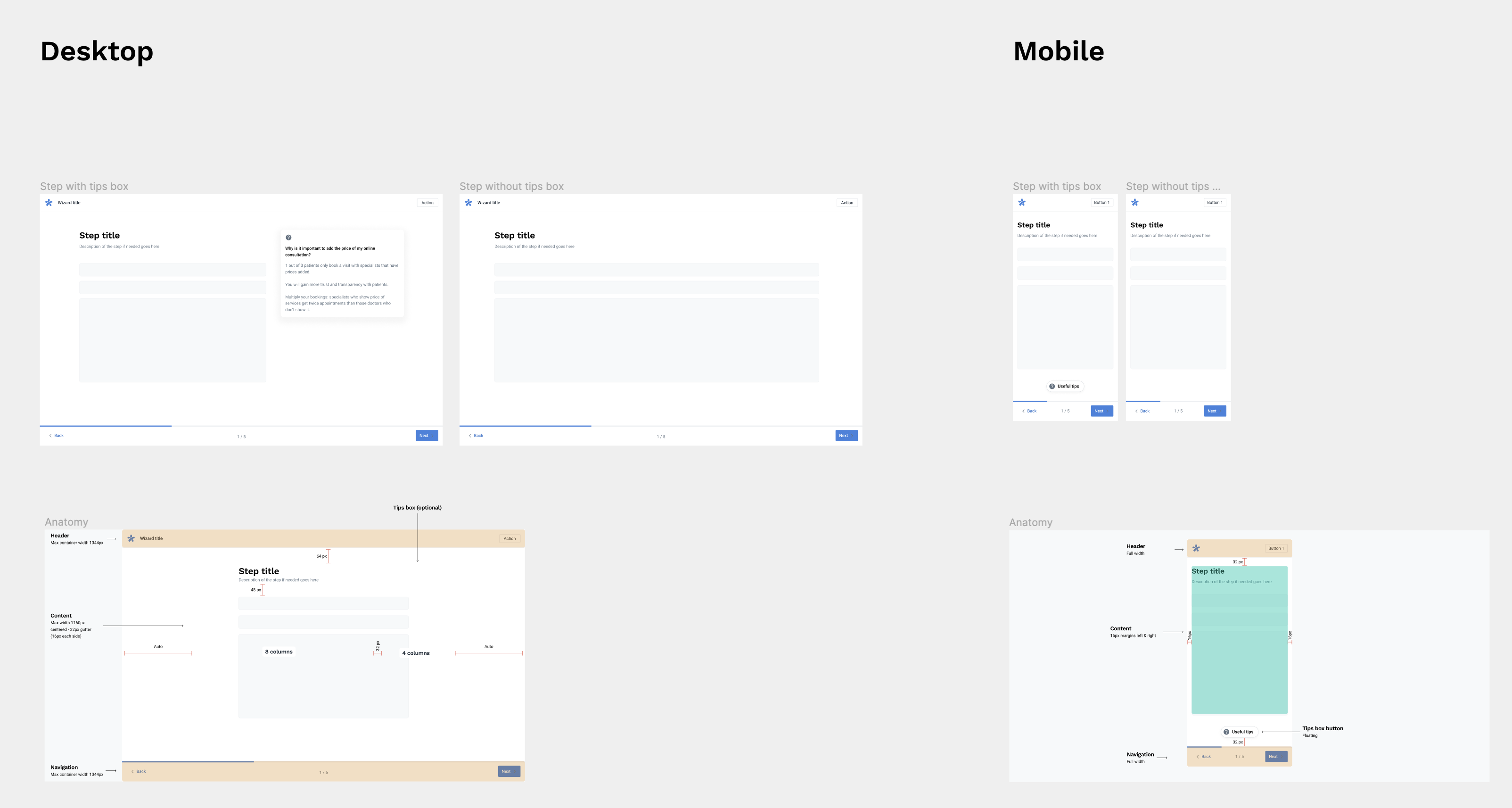
To tackle the complex challenges, we split the project into three tracks: rethinking product IA, rethinking settings IA, and rethinking onboarding and wizards. We took a two-fold approach:
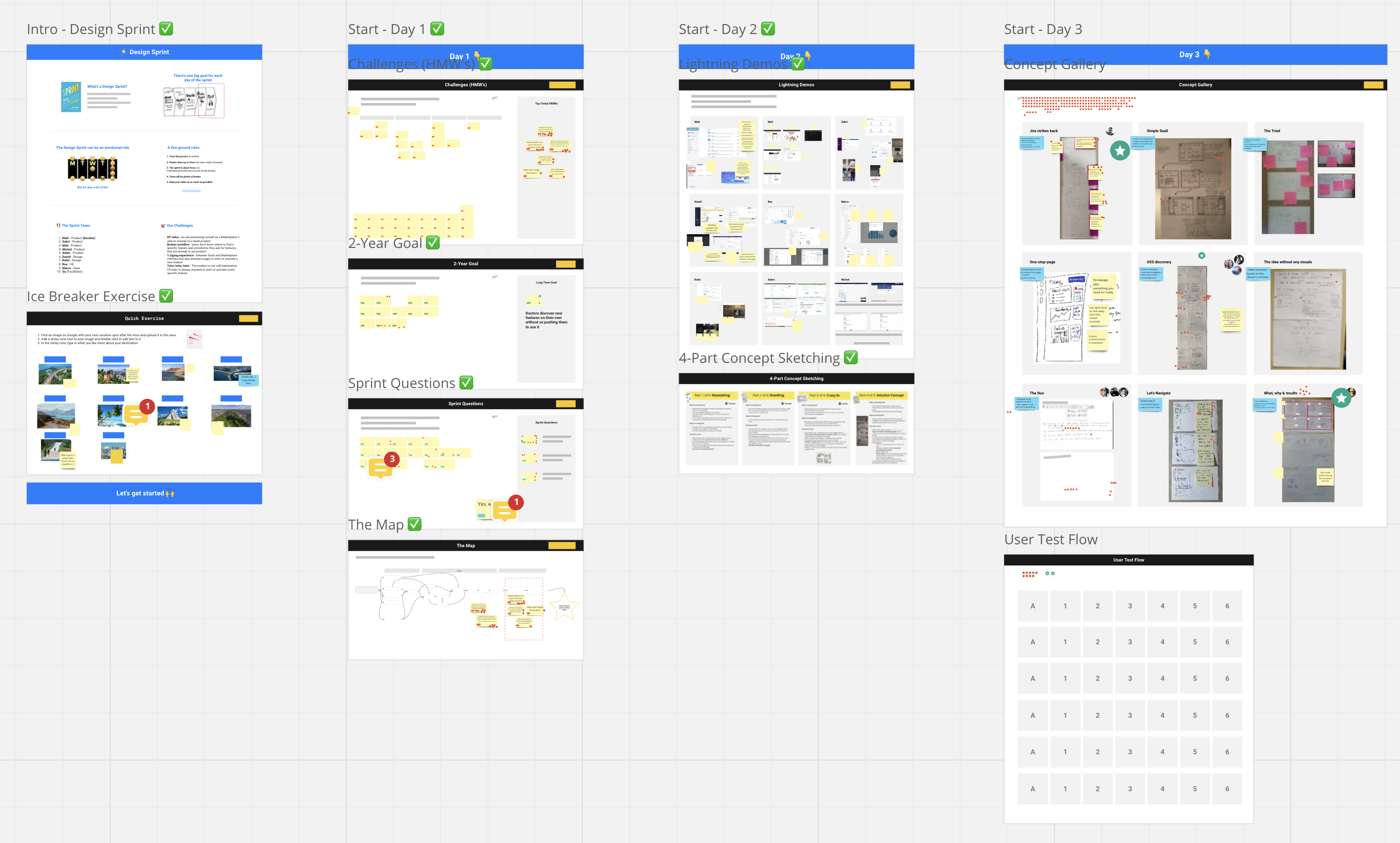
- Design Sprint for Product IA: I, alongside two other designers, conducted a thorough Design Sprint to revamp the architecture, fixing broken workflows, improving user experiences, and ensuring consistency in UX. This collaborative effort resulted in optimal solutions.
- Async Sprint for Settings and Onboarding: We followed an iterative approach with daily syncs on slack with our stakeholders to gather feedback, ensuring consistent refinements of the settings and onboarding processes
Design explorations
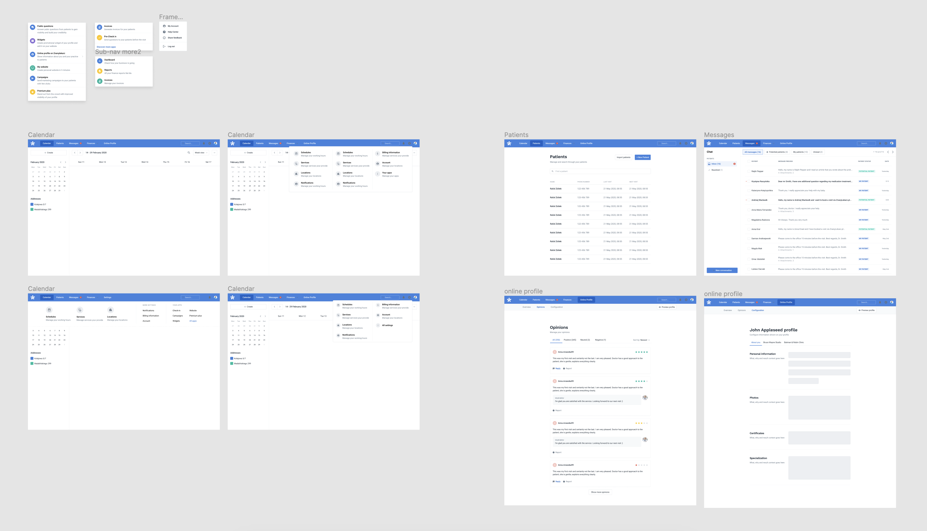
After completing a design sprint, we began brainstorming the design approach. I developed multiple prototypes for the new navigation, onboarding, and activation processes.
Outcomes
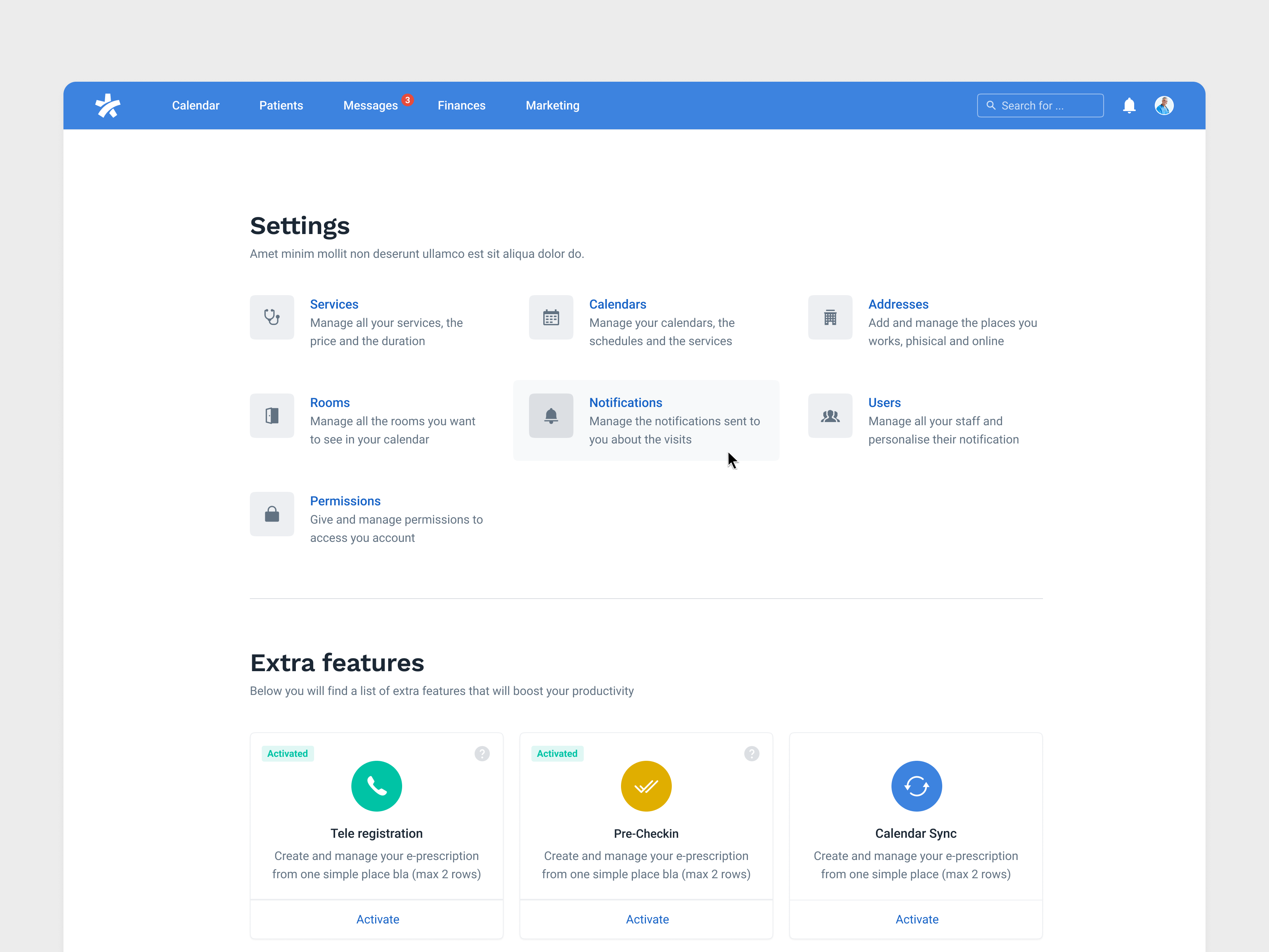
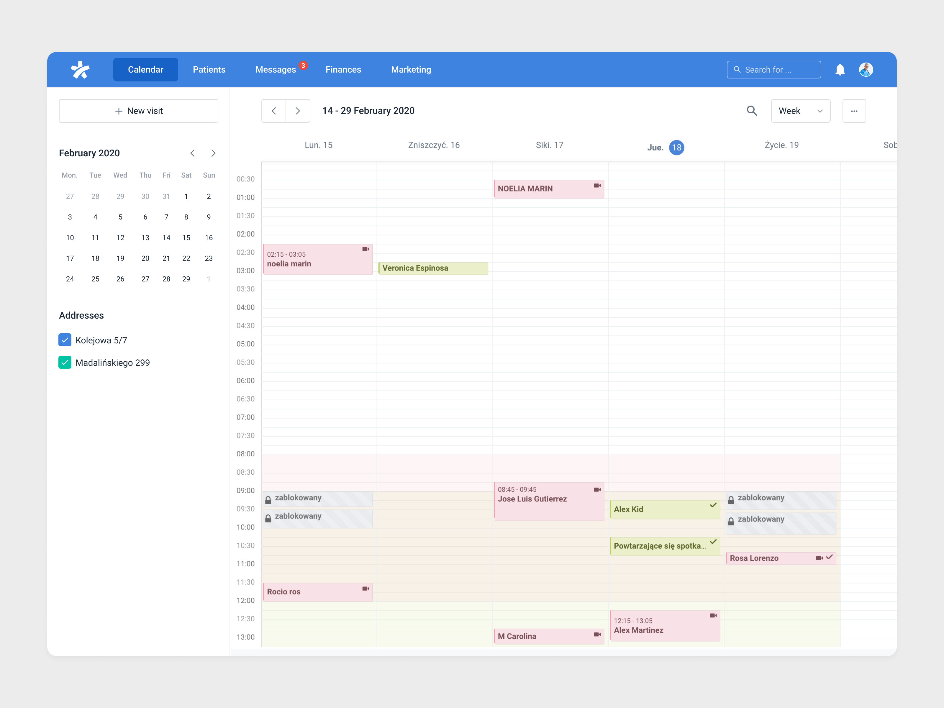
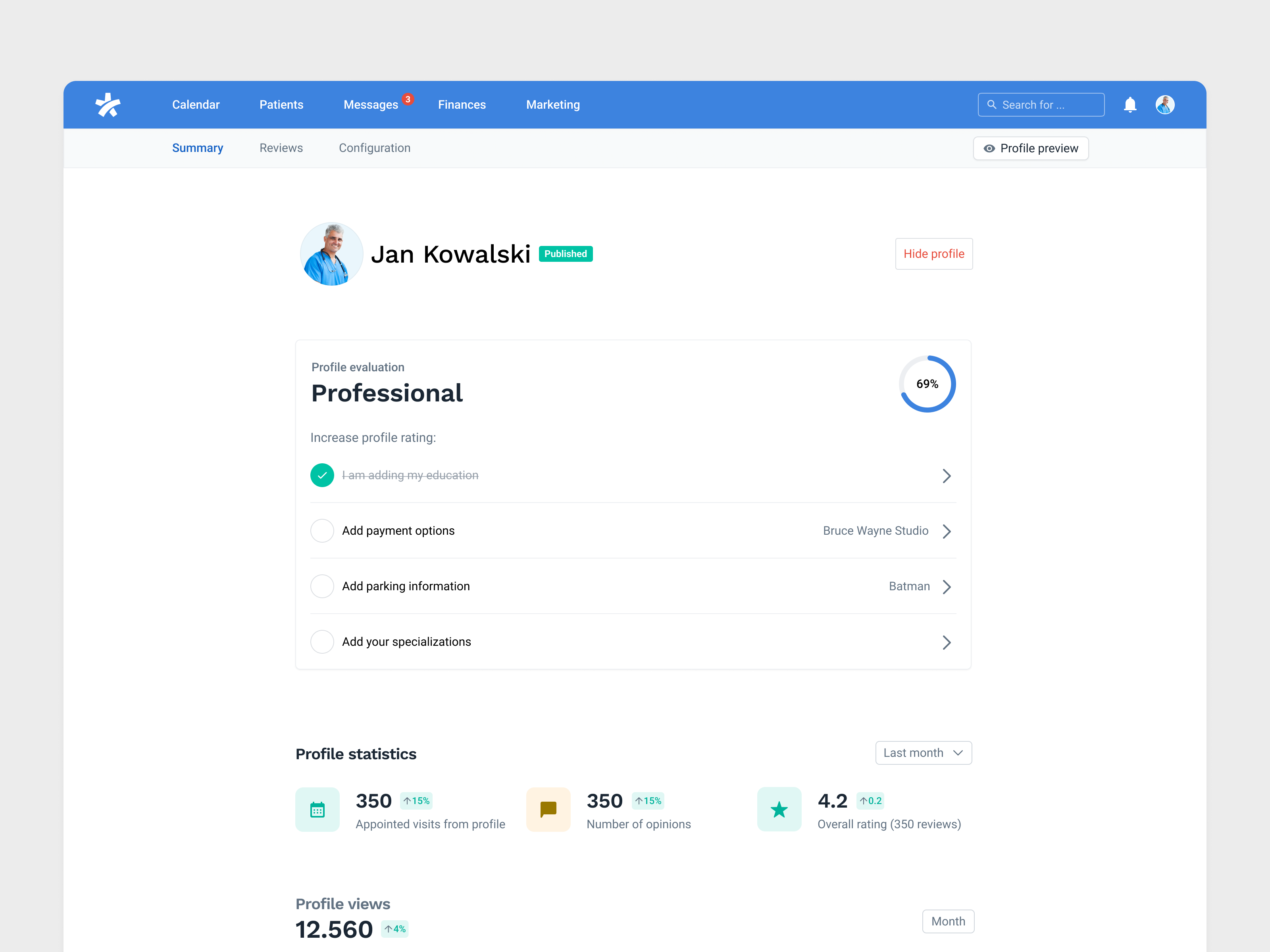
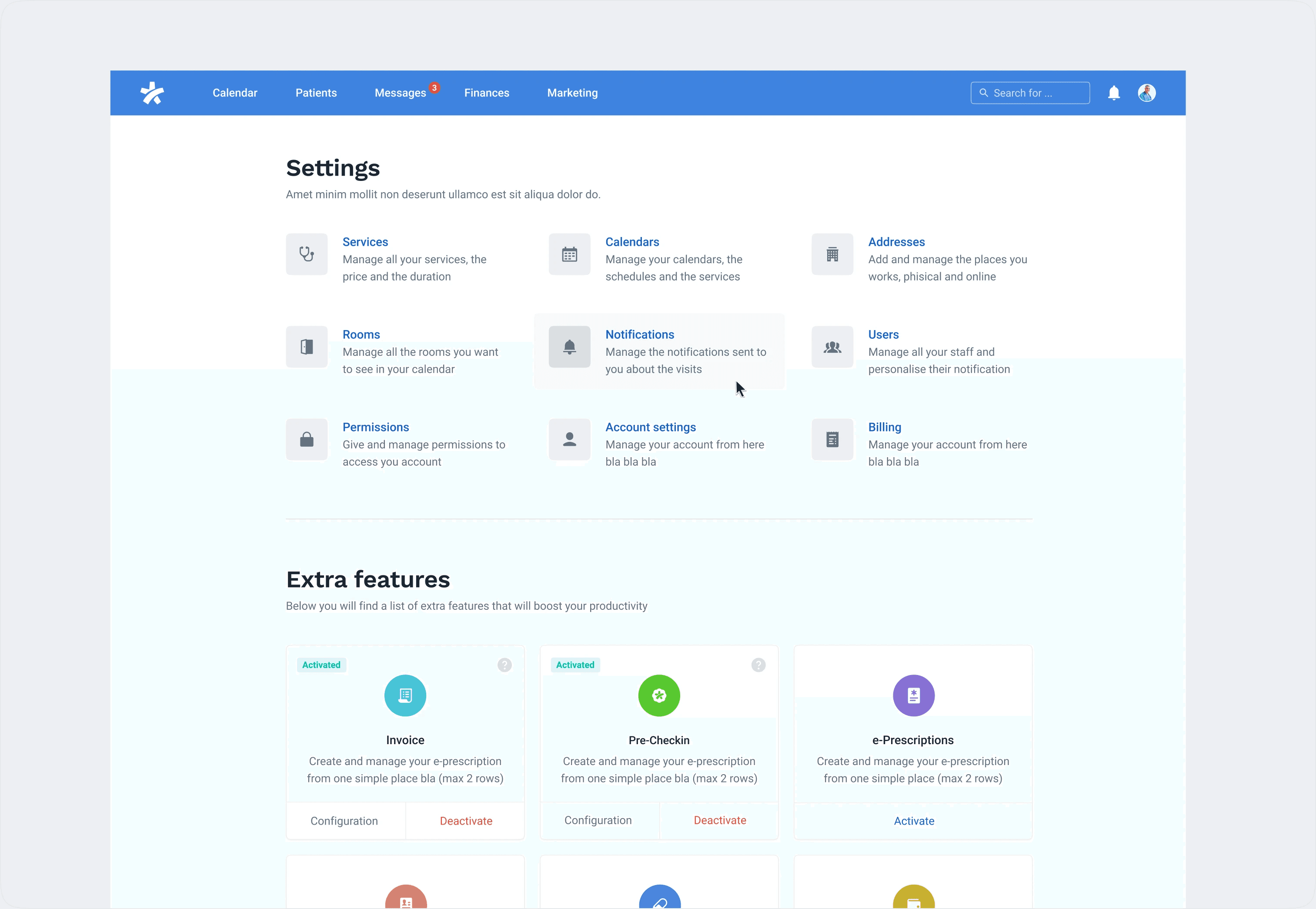
- Simplified navigation: Revamped navigation with clear categories: Calendar, Messages, Patients, Finance. Right side contains Global Search, Notifications, Online Profile, Settings, Help, and Logout.
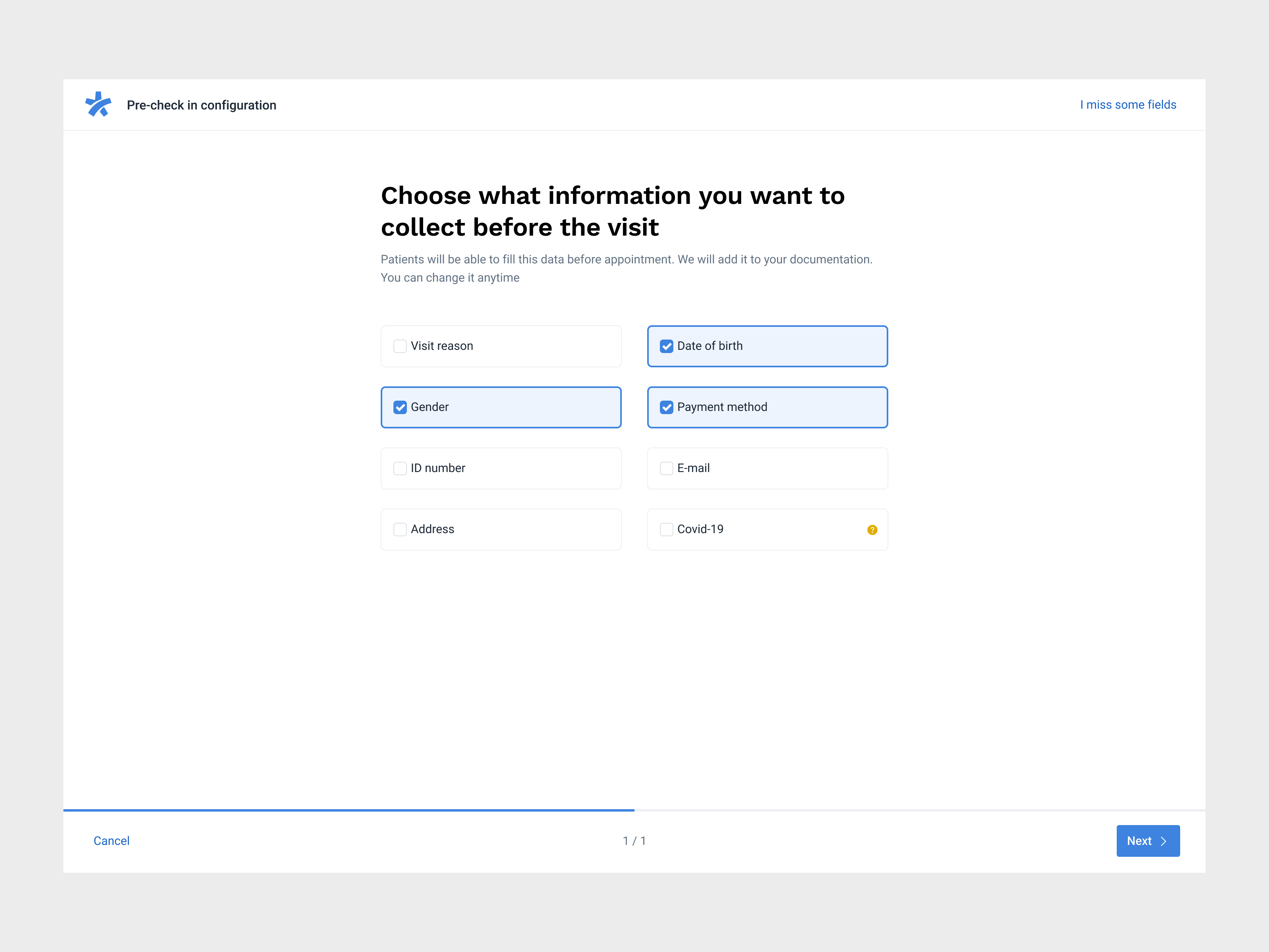
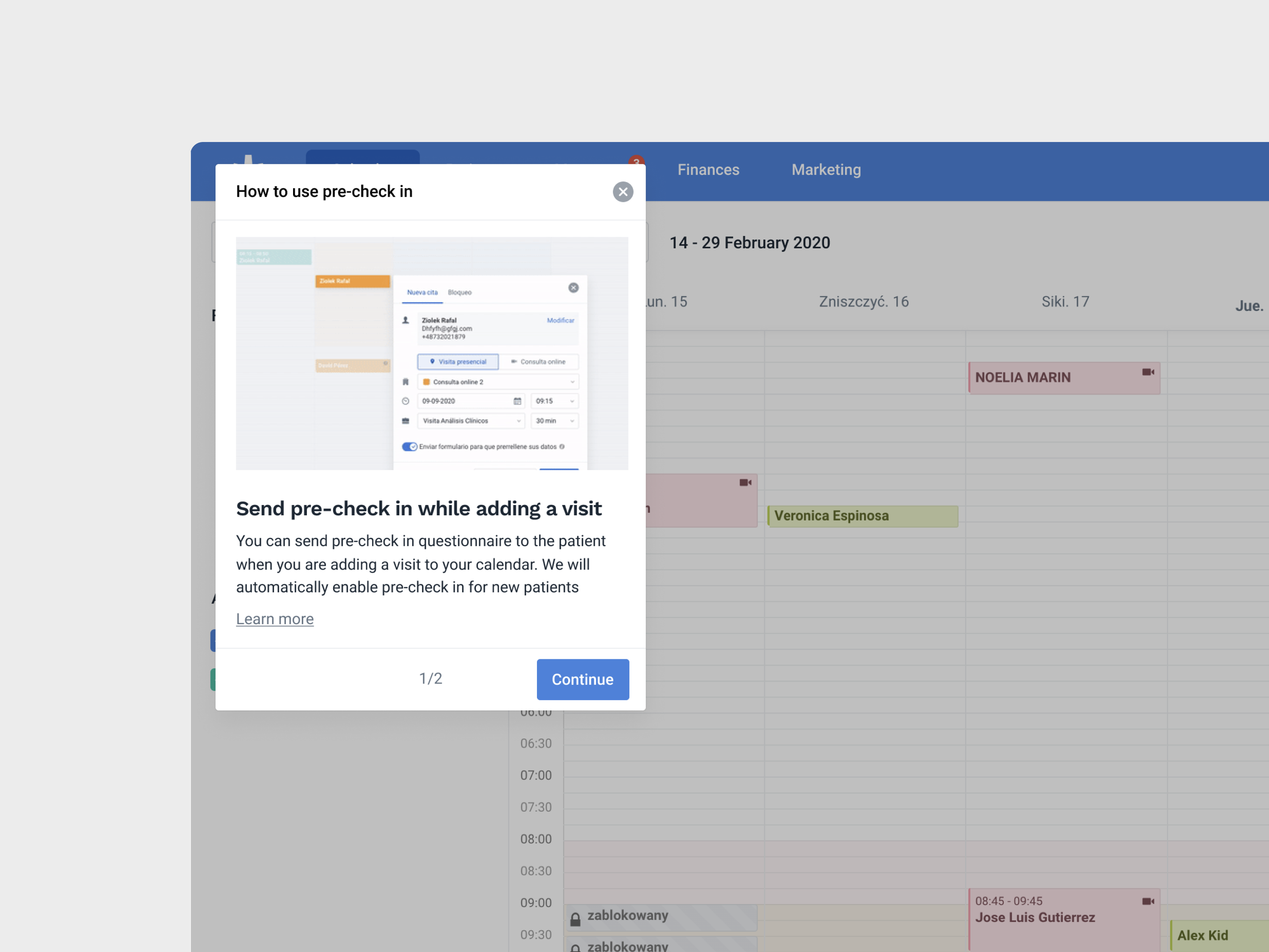
- Extra Features: Streamlined approach, main features upfront with optional add-ons like website, widget, pre-checking in settings.
- One-Settings: All settings consolidated in one location.