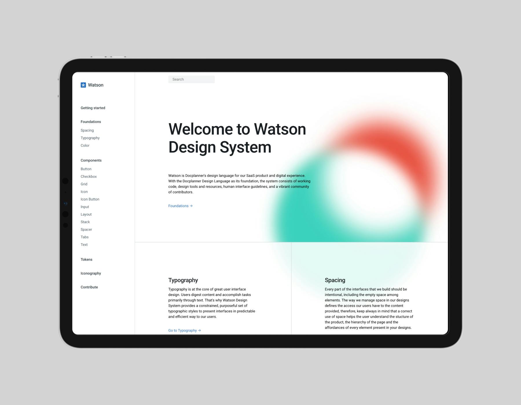
Watson Design System
Watson is Docplanner's design language for our SaaS products and digital experiences. The system consists of working code, design tools and resources, and human interface guidelines.
Company
DocplannerYear
2022 — OngoingScope
User Interface Design, Prototyping, DocumentationVisit
watson.docplanner.design
Background
In 2022 I joined a design systems team at Docplanner. This team was responsible of maintaining our existing UI library we used in our products. During the 2022 together with the team we created a new design system tailored for our SaaS product called Watson.
Initial state
Before Watson, Docplanner utilized the UI Kit library, which was based on Bootstrap. Although this approach proved to be fast and cost-effective in the beginning, it started revealing its drawbacks as the company expanded its products and teams.
The issues we faced
Supporting two products
The UI kit library served two products with different user bases. Our SaaS platform for doctors that prioritized efficiency and daily use, and the marketplace the emphasized discoverability and information presentation. This led to issues with our directives, as the components could only be reused in one product.
Lack of control
The UI Kit library depended on third-party libraries that don't allow much customization. This dependency makes our system less flexible and harder to update according to our product's evolving needs, leading to outdated components in the system.
Accessibility
Neither our foundations nor components were never created with accessibility in mind. The usage of third-party libraries was not helping the case as well. This generated debt regarding the WCAG conventions: lack of proper roles, aria-labels, keyboard navigation, or color contrast specs.
No shared language
Documentation was scattered in multiple places. We had separate documentation for developers and for designers. They presented information about components differently, with naming and UI inconsistencies across them. This generated confusion, and people wasted time finding the right solution or place to answer their doubts.
Introducing Watson
After auditing an effort to fix the current solution, we realised it’s better to start with a clean slate. As our previous library was started with marketplace in mind, we proposed creating an official team in charge of the new design system tailored for SaaS.
Our goals
We wanted to create a system that tackles many of our past issues at the roots. A custom solution tailored to our needs with unified language between design and development, accessibility engraved in its DNA, and clear extensive documentation.
Step One: Foundations and layout
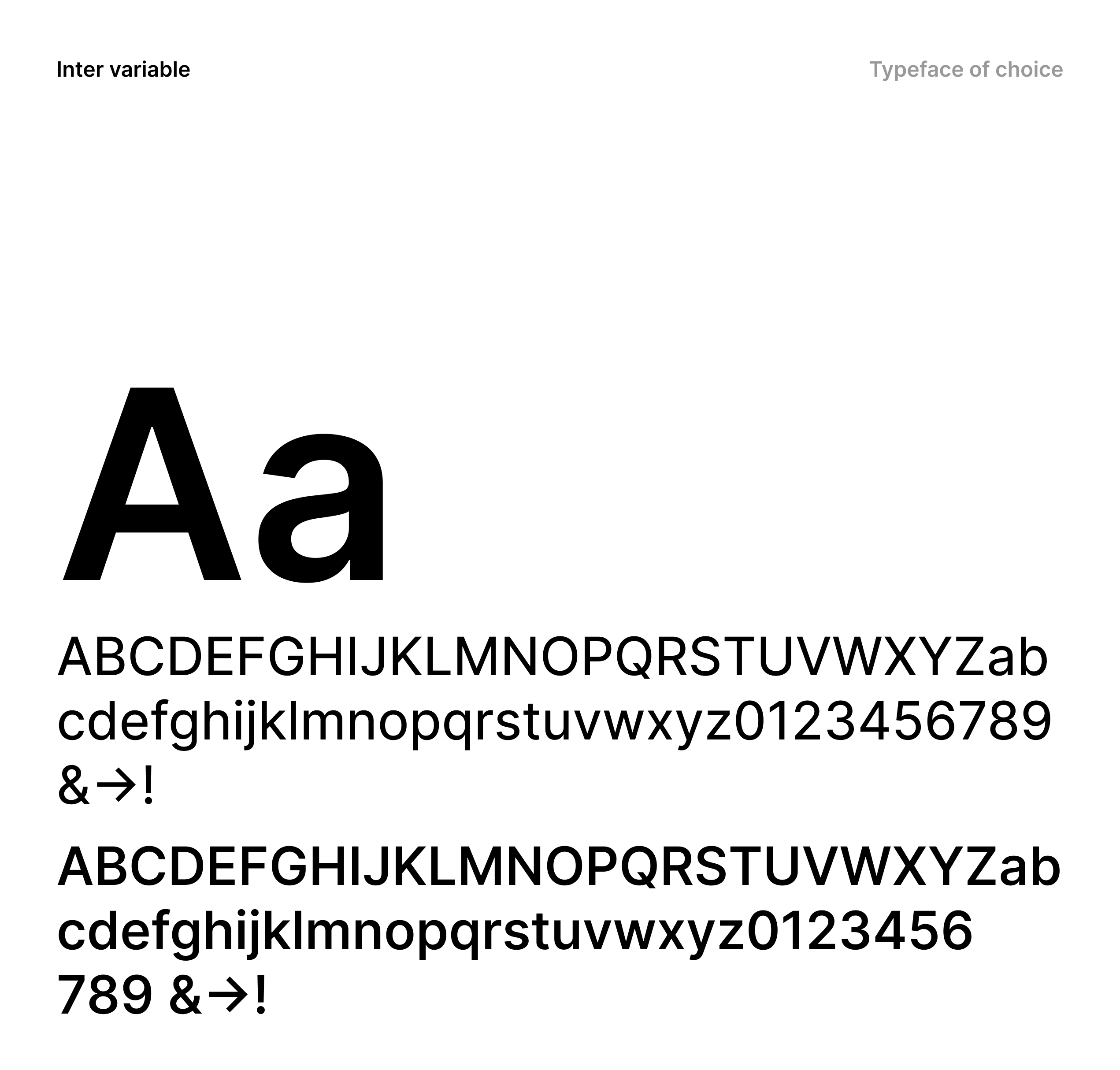
Typography
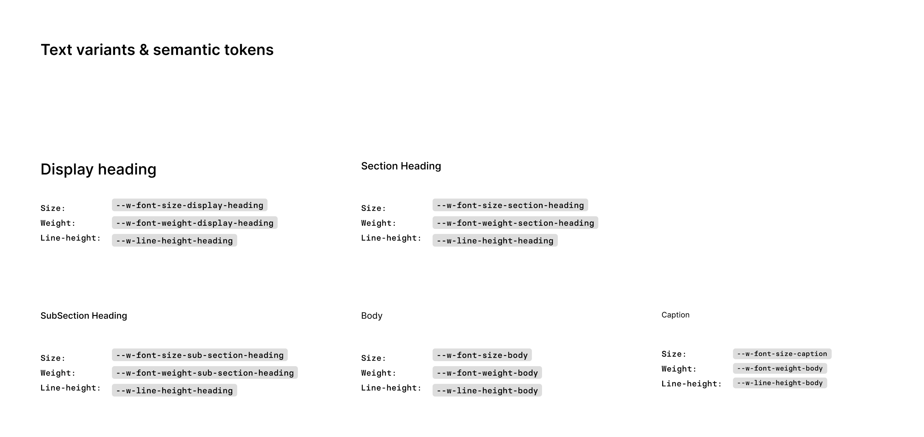
We decided to start with the foundational design directives, such as spacing, typography, and colors. It allowed us to create solid foundations with strong emphasis on scalability and semantics. I was responsible for typography which included a new scale, styles and tokens & component definition.
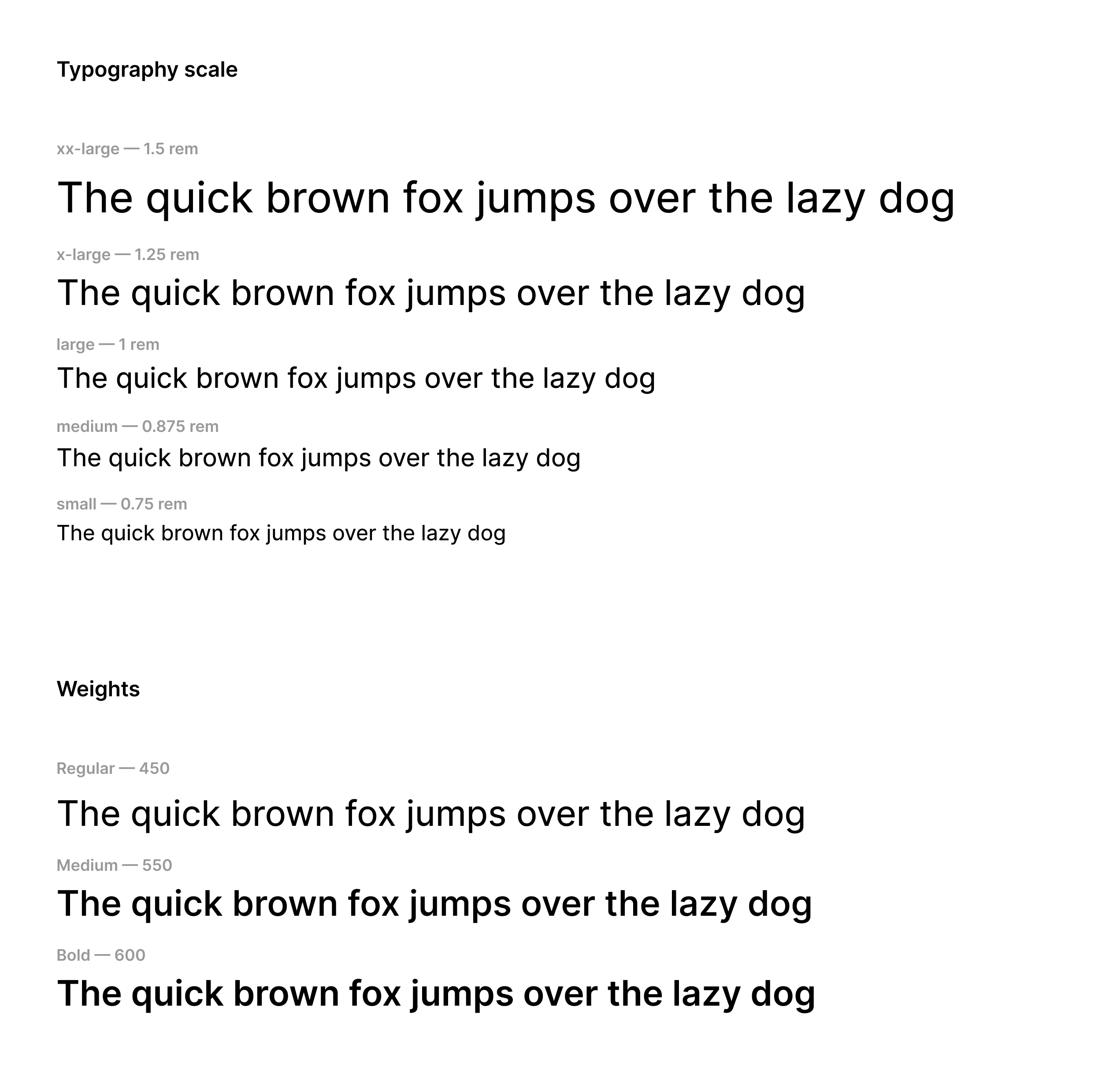
After defining the scale I worked on design tokens that would let us define semantic styles with clear usage.
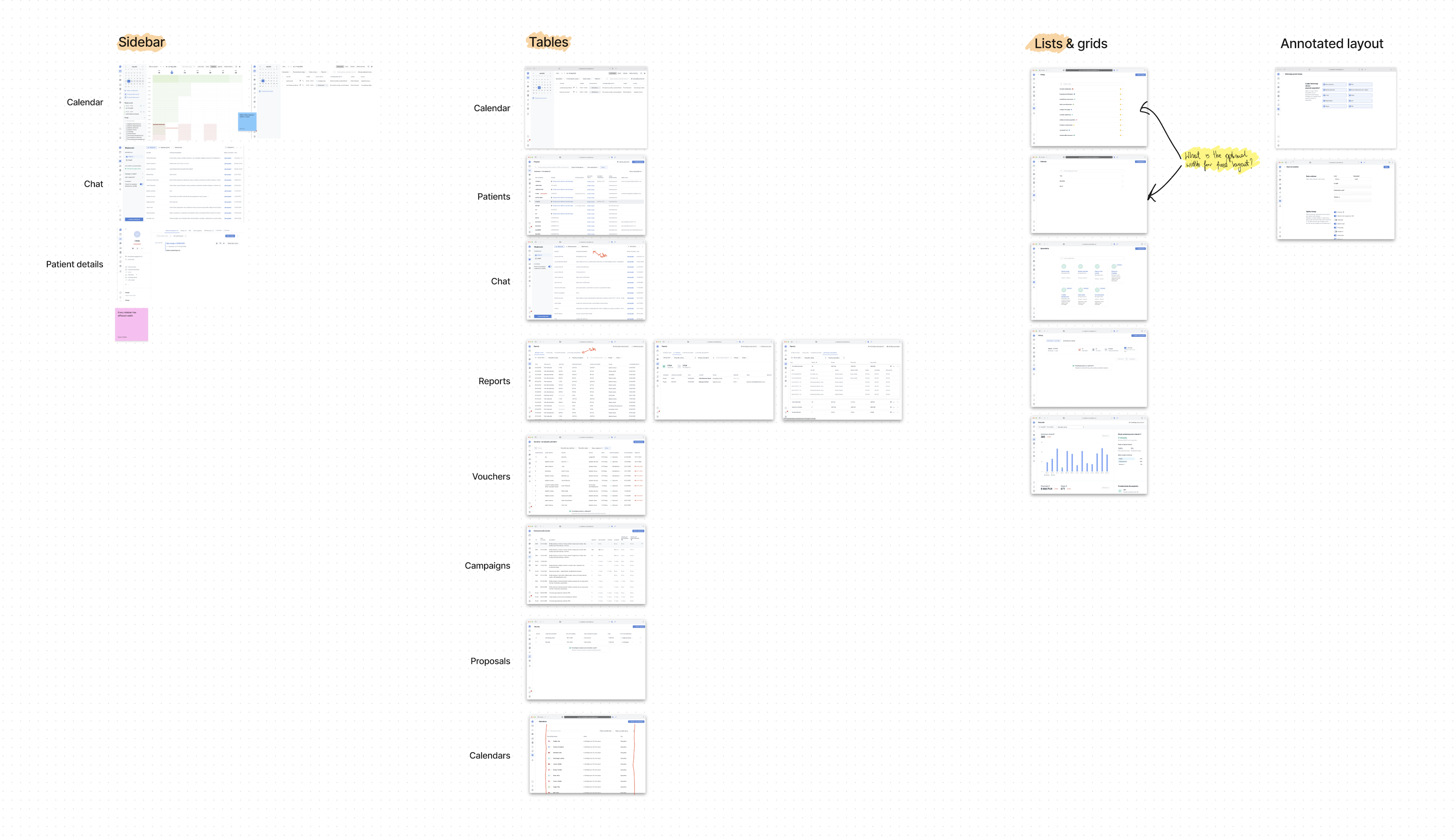
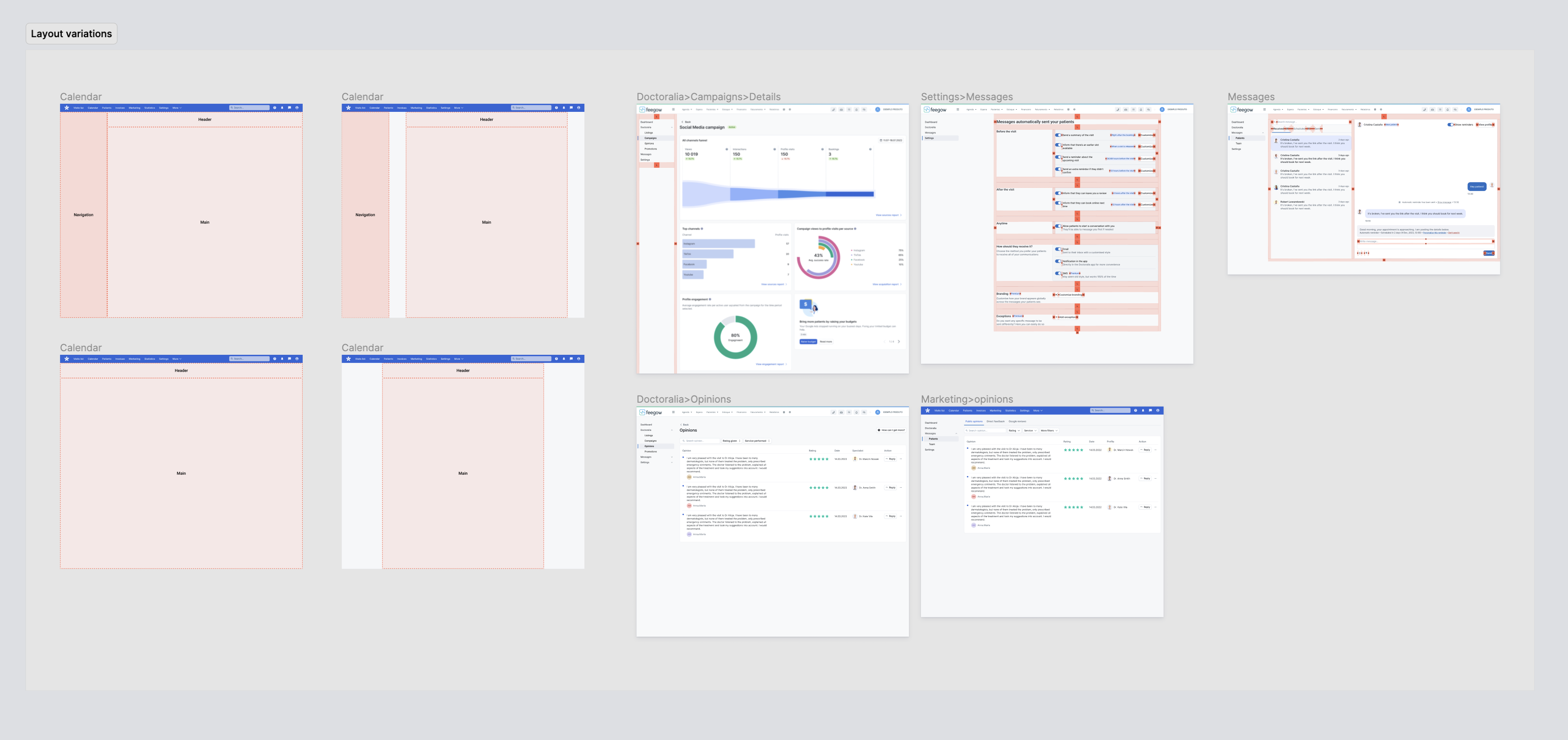
Layout
Another huge issue that our designers and developers struggled with were page layouts. We didn’t have any guidelines on the existing layouts. Designers were designing them from scratch every time, which resulted in inconsistency in terms of spacings, widths and made it impossible to implement changes.
After auditing the product, I mapped all screens to find common features between the pages. I designed a proposal of a unified layout that could cover all pages, and wrote an extensive documentation with best practices that could help designers decide what layout suits their needs best.
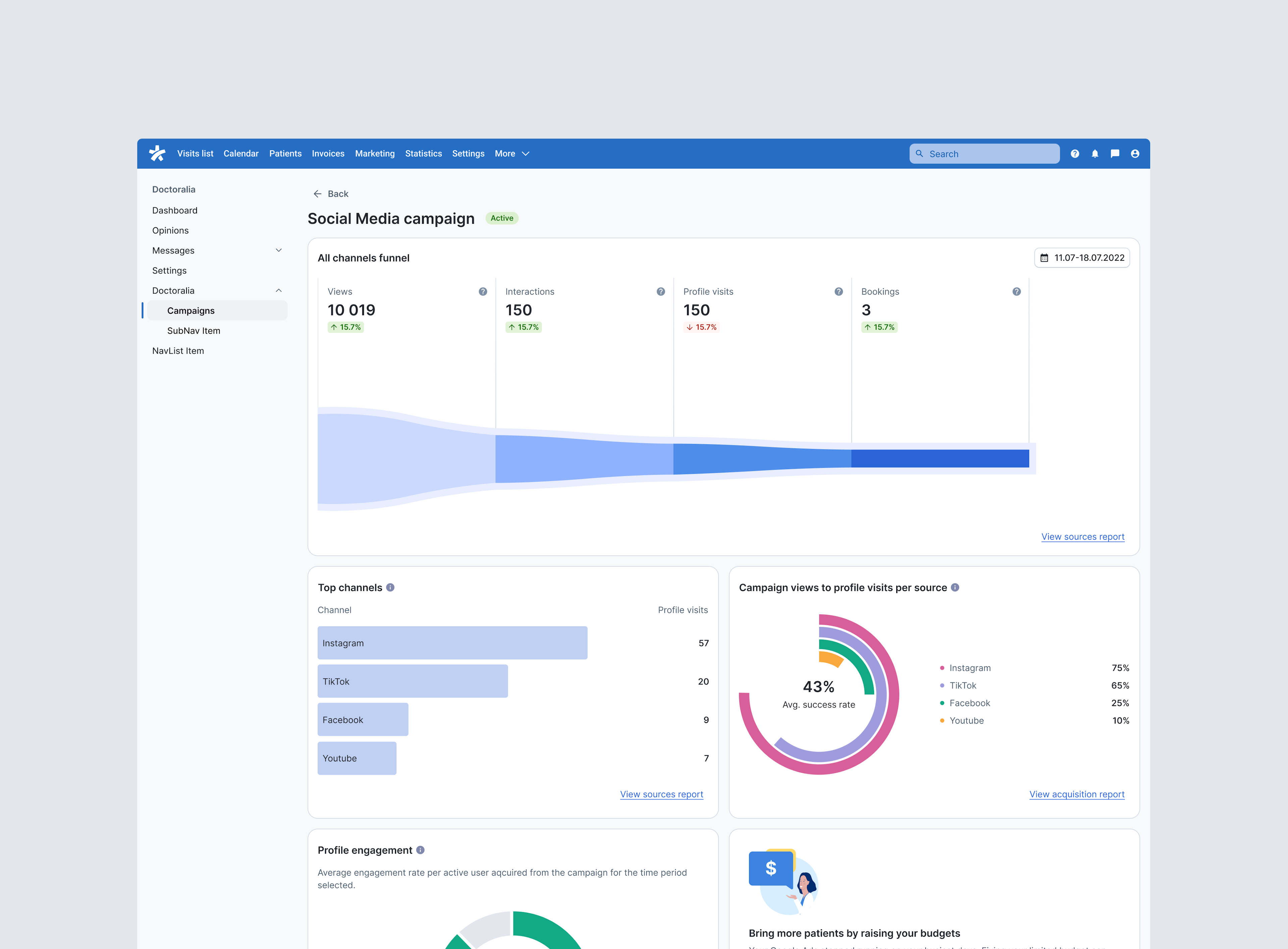
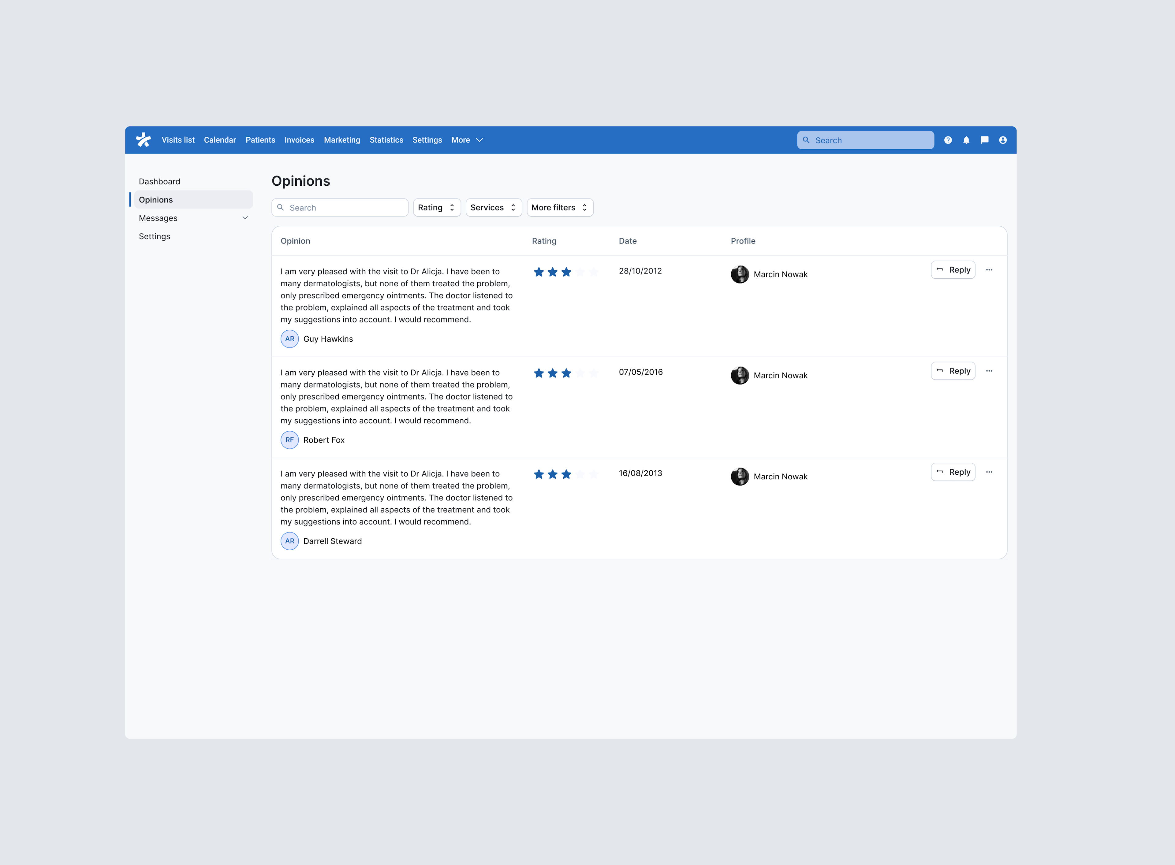
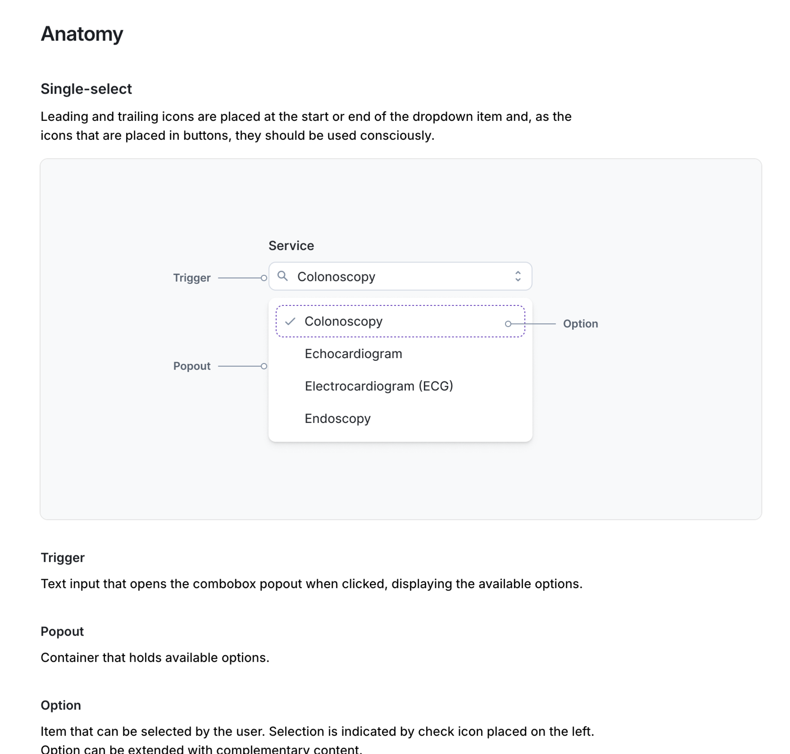
Step Two: Components
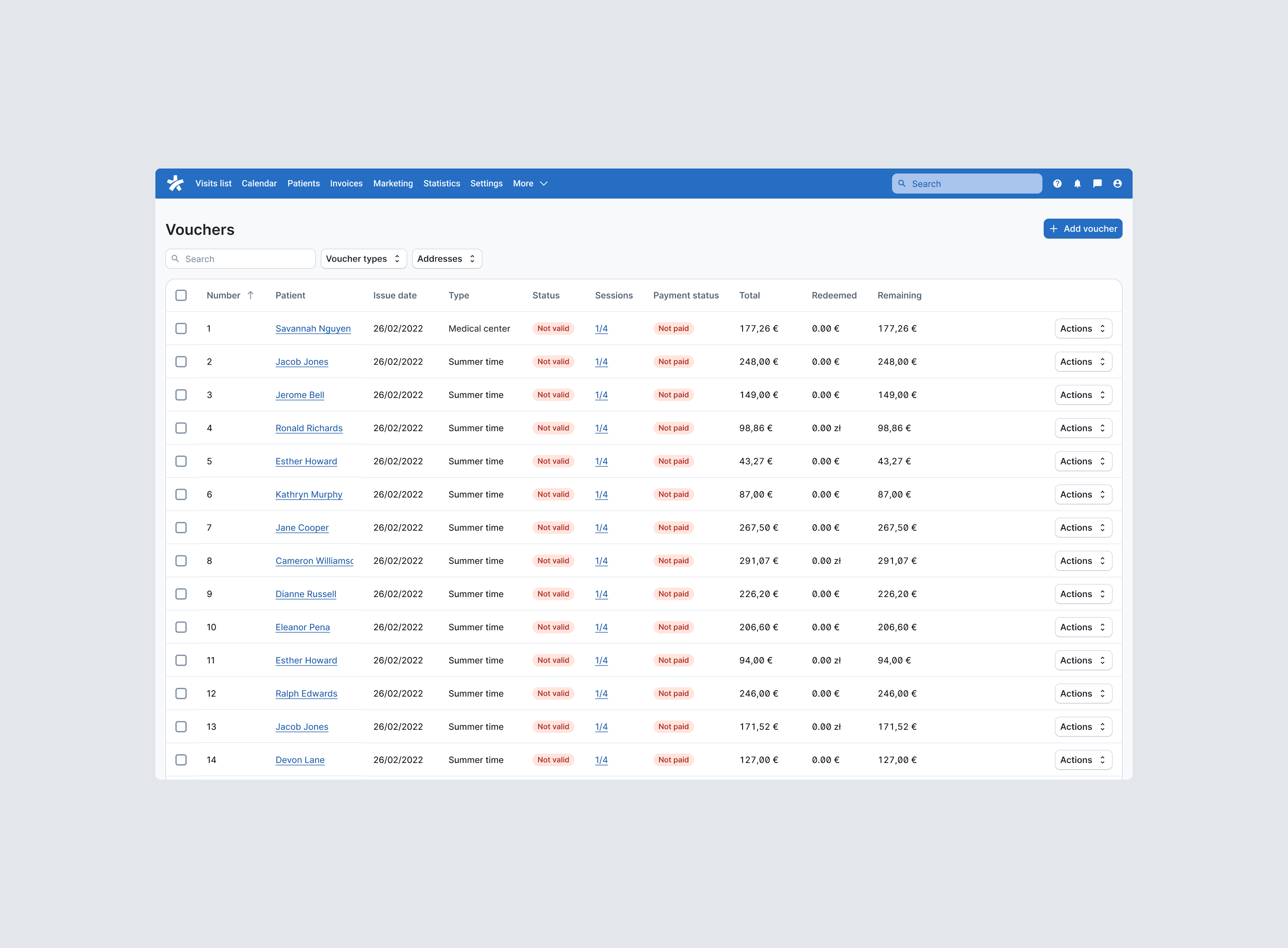
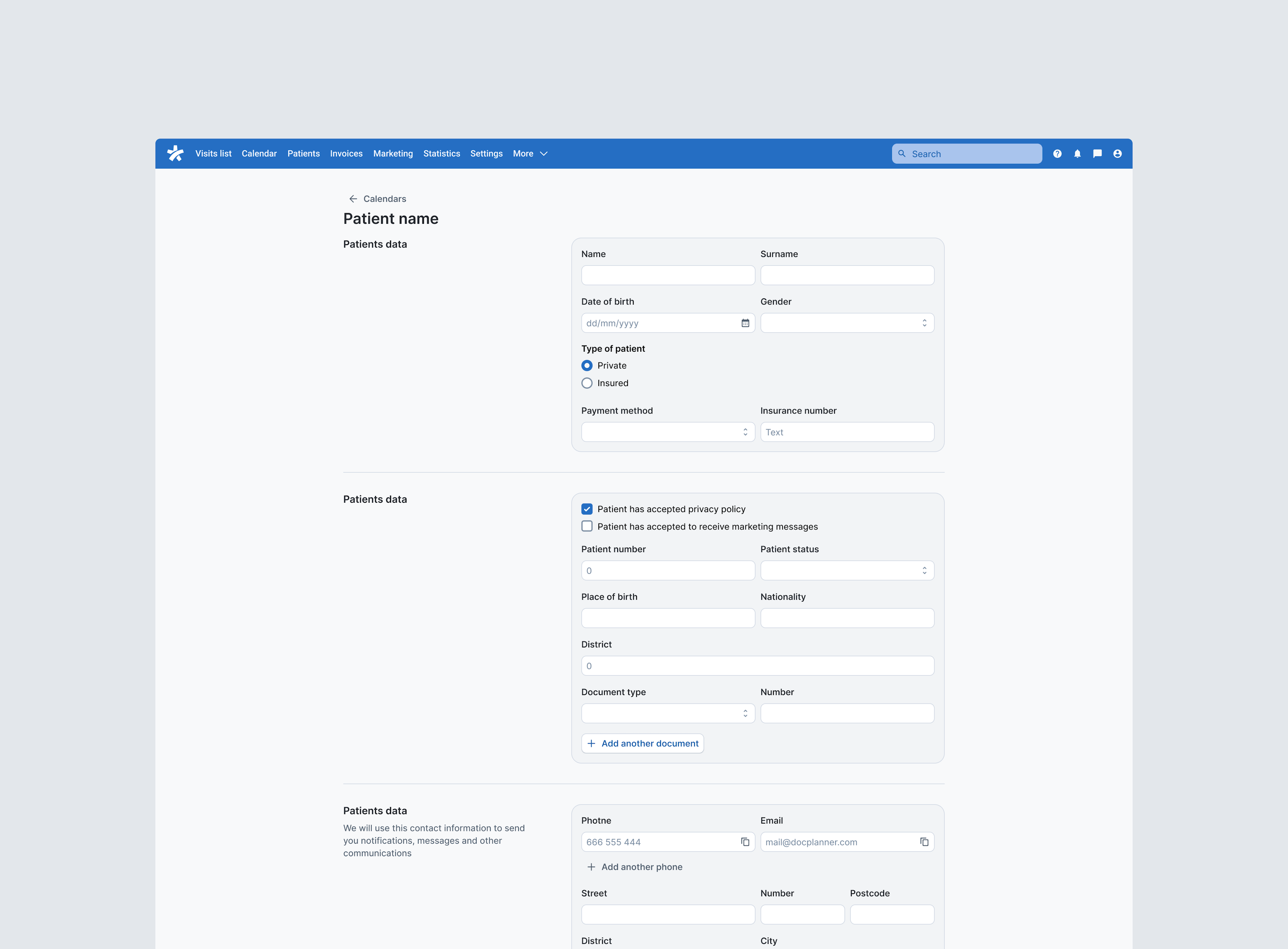
After we tackled foundations and layouts, it was time to start working on individual components. Our SaaS mostly consists of two things: forms and tables.
We decided to tackle forms first. We saw an opportunity to provide a good amount of components that are used across many screen and vastly improve accessibility.
Design process
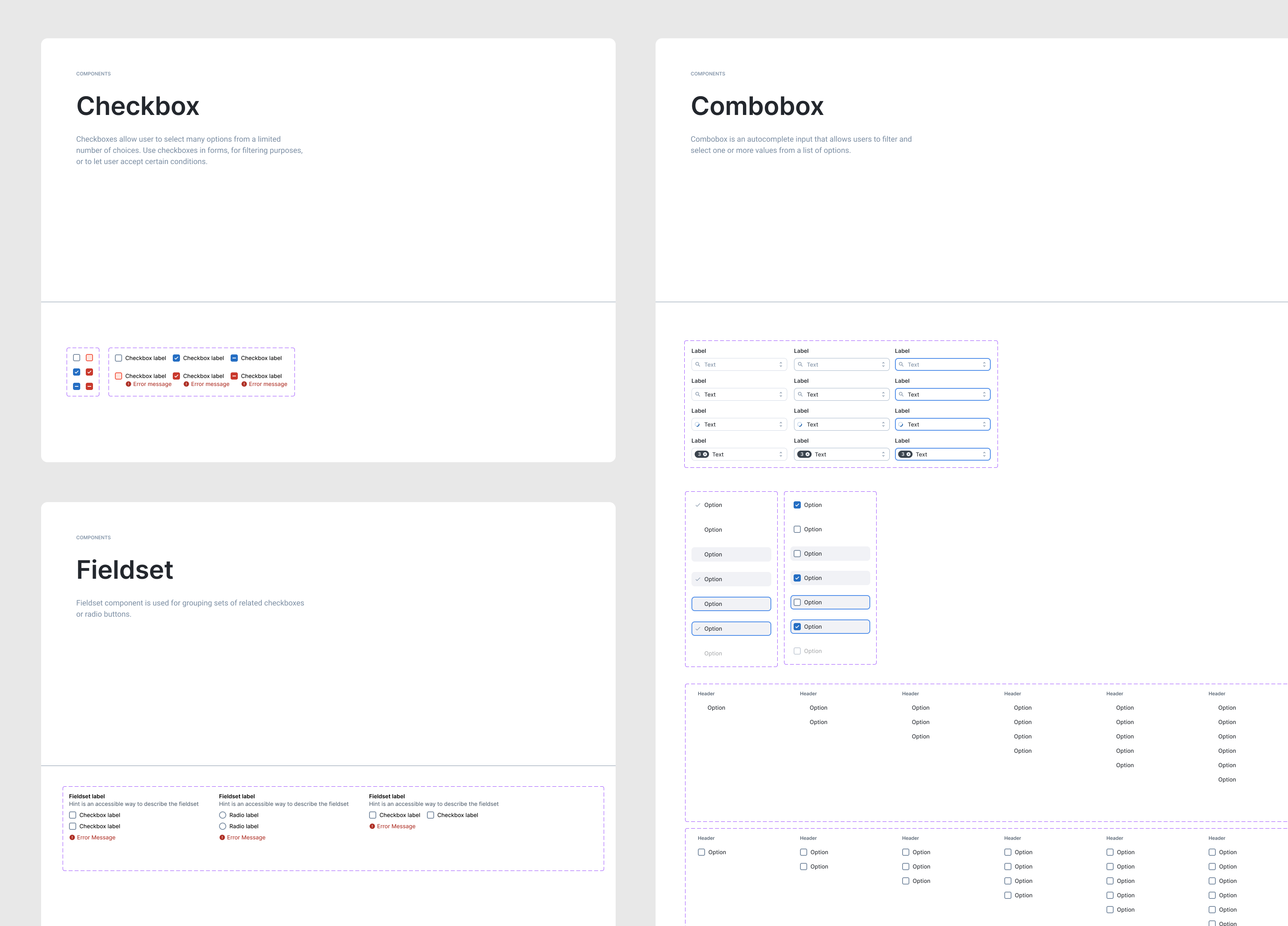
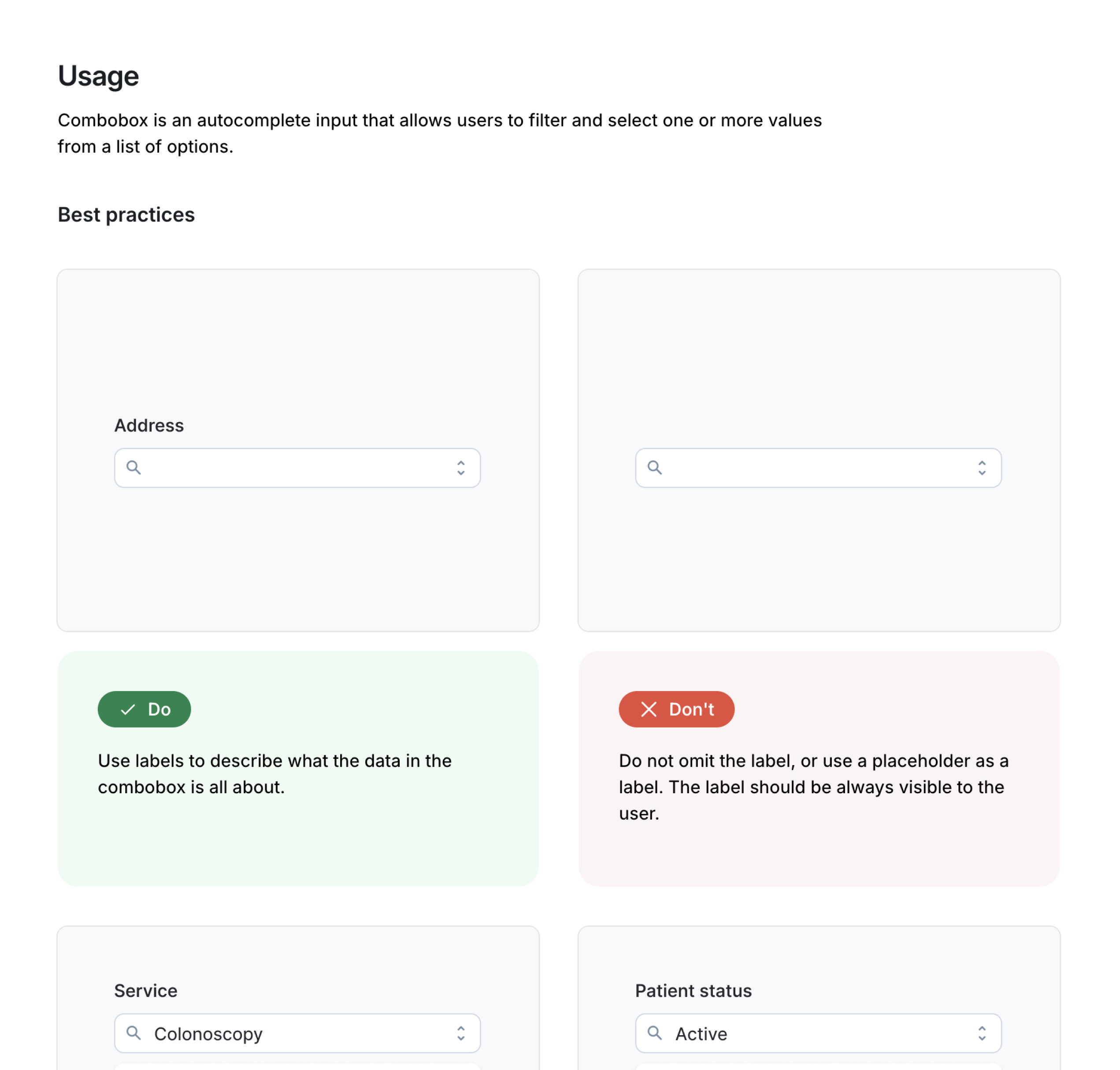
The development of each component involved auditing current versions for issues, exploring designs to improve and align with new standards, proposing components with accessibility and API features, and creating simple, visual documentation on usage and best practices.
Documentation
Documenting components and design desicions behind them was one of our core principles when working on Watson. Every component includes a detailed documentation on the behaviour and it's usage.
Conclusion
Watson has been positively acclaimed in Docplanner and it's adoption grows everyday. It improved not only speed and workflow of designers and developers, but also communication between these two roles.